Saved Bookmarks
| 1. |
Following table shows a frequency distribution for the speed of cars passing through at a particular spot on a high way. Draw a histogram and frequency polygon representing the data above. |
|
Answer» Solution :Clearly, the given frequency distribution is in exclusive form. Along the horizontal axis, we present the class intervals on some suitable SCALE. The corresponding frequencies are represented along the vertical axis on a suitable scale. We construct rectangleswith class intervals as the bases and the respective frequencies as the HEIGHTS. ltbgt Let us draw a histrogram for this data and mark the mid-points of the top of the reactangles as B,C,D,E,F,G and H, RESPECTIVELY. Here, the first class is 30-40 and the last class is as B,C,D,E,F,G and H, respectively. Here, the first class is 30-40 and the last class is 90-100. Also, consider the imagined classes 20-30 and 100-110 each with frequency 0. The class MARKS of these classes are 25 and 105 at the points A and l, respectively. 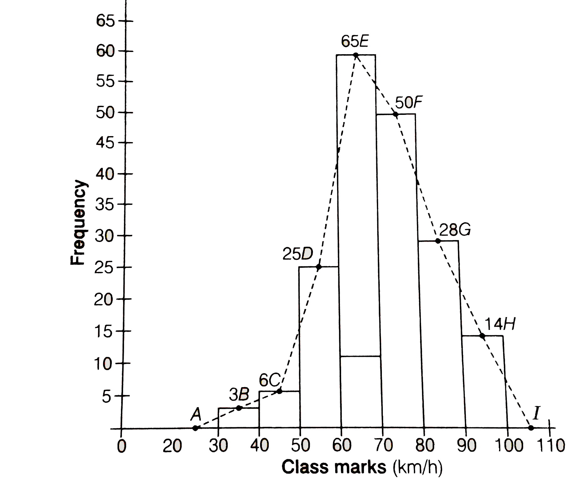 Join all these points by dotted line. Then, the curve ABCDEFGHI is the required frequency POLYGON. |
|